Color is your product’s first handshake. It’s the thing screaming (or whispering) at shelf level, long before someone reads your label or flips your box to see nutrition info.
However, many CPG brands, especially early-stage food brands, treat color as an afterthought. Or worse, they go beige in the name of “minimalism” and disappear completely.
As a consumer packaged goods marketing agency, we’ve seen this story a hundred times. The founder has the product dialed, the margins tight, and the vision big. And then, the packaging hits the shelf, and… nothing. No clicks, no grabs, just shelf blindness.
Here’s why that happens, and more importantly, how to fix it.
What Color Actually Does (Backed by Science, Not Vibes)
Color hits the brain before language. It’s emotional, fast, and deeply tied to human behavior.
An Emerald study shows that up to 90% of snap product judgments are based on color alone. It means our brains try to make quick, low-effort decisions in a high-stimulation environment.
Sound familiar? That’s a grocery aisle on a Wednesday.
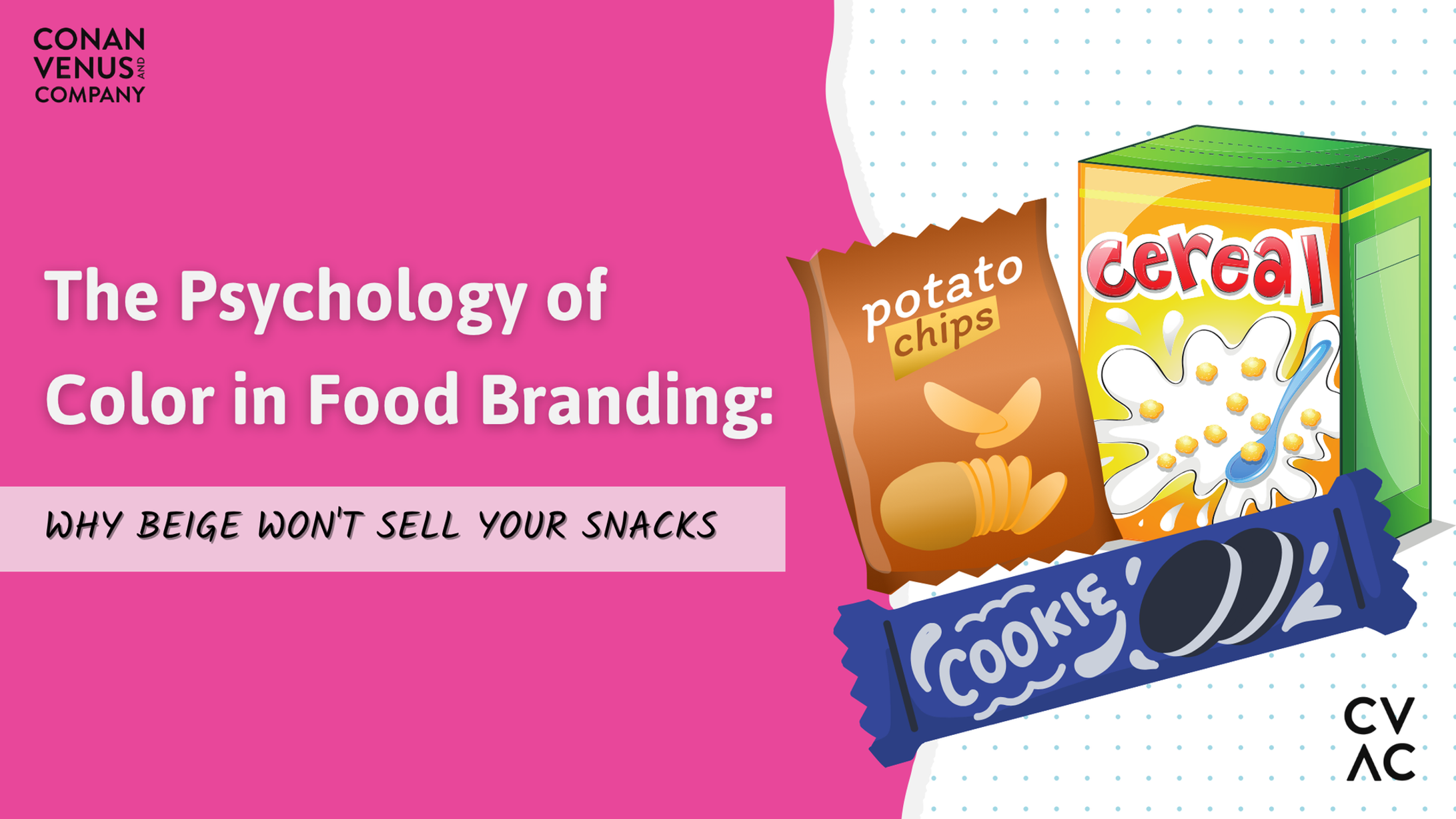
Here’s how color shows up in CPG food branding:
|
Color |
Emotional Cue |
Common Use |
|
Red |
Appetite, urgency, heat |
Spicy snacks, indulgent treats |
|
Green |
Freshness, health, nature |
Organic, plant-based, sustainability-forward foods |
|
Yellow/Orange |
Energy, fun, affordability |
Breakfast foods, kids’ snacks, budget-conscious brands |
|
Blue |
Trust, clarity, hydration |
Dairy, water, functional beverages |
|
Black/White |
Premium, minimalist, bold |
Upscale or wellness-first brands |
Choosing color without understanding these triggers is like launching a product without checking your ingredients. Looks excellent, sells meh.
Real Brands That Are Owning the Shelf with Color
Let’s call out some food brands that are nailing their color strategy:
1. OLIPOP – Pastel Precision
Soft, flavor-mapped pastels signal both wellness and fun. Each SKU uses a different pastel shade to align with flavor (peach for peach, mint for ginger lemon, etc.). It feels clean without feeling clinical.
2. Siete Foods – Bold Meets Cultural
Earthy tones with bright contrasts bring heritage to the front of the package. The result? Authenticity that punches through on crowded natural food shelves.
3. Magic Spoon – Nostalgic Neon with a Health Twist
Vivid purples and tropical blues feel like Saturday morning cartoons… except with protein macros and no sugar crash. Their color use creates a dissonance that works.
4. A Dozen Cousins – Simplicity with Soul
Deep greens, mustard yellows, and rich neutrals create a “real food, real roots” vibe. They’ve built trust through visual confidence, not loudness.
These brands didn’t “pick pretty colors.” They built a system and led with emotion. And they did it consistently.
The Beige Mistake (And Other Common Offenses)
We see a lot of the same color mistakes, especially with first-time founders:
- The Safe Beige: Clean, natural, and… completely forgettable. You’re not Whole Foods in 2006.
- The Green Trap: Every “healthy” food brand goes green. Suddenly, you’re one leaf in a whole forest.
- Contrast Chaos: It’s a pretty design, but no one can read the product name. Congrats! You’ve designed for yourself, not your buyer.
- Inconsistency: Your Instagram uses neon pink, your website uses navy, and your packaging uses sage. Pick a lane.
If your color choices don’t reinforce your product, values, and audience expectations, you’re making people work too hard to buy from you.
What a Consumer Packaged Goods Marketing Agency Like CVAC Actually Does
We get it, color feels subjective. It’s easy to argue about “what looks cool.” But we’re not here to argue. We’re here to systemize.
When you work with a legitimate consumer packaged goods marketing agency, color strategy becomes a business tool, not a moodboard battle.
Here’s how we approach it at CVAC:
1. Emotional Targeting
We identify what your audience needs to feel when they see your product. Then, reverse-engineer the color palette that delivers that feeling.
2. Category Mapping
We look at your shelf landscape. What are competitors doing? What colors are overused? Where’s the whitespace? Then we put you just left of expected.
3. Color Psychology Testing
We audit how different colors perform under various lighting, packaging substrates, and digital backdrops. What works in Figma doesn’t always work under fluorescents.
4. Systemic Design
We build a color system that translates to your website, social media, pitch decks, and trade booths. You name it. One palette. Infinite applications.
5. Shelf Simulation + Feedback Loops
We do in-store tests to gauge visibility and recall. We iterate fast and share real feedback that moves the needle.
Color Is the Starting Line—Not the Finish
Color doesn’t sell snacks. But it does get you picked up.
And in food, that’s the whole game.
If your packaging gets skipped, it doesn’t matter how clever your copy is or how clean your ingredient list reads. Color opens the door. The rest of your brand has to walk through it.
So, if your shelf performance is underwhelming, if your DTC cart rates are down, or if you’re just feeling like your brand has “a nice look but no traction,” color is the first place to dig.
Ready to Rethink Your Palette?
We’ve helped challenger brands go from shelf-invisible to shelf-dominant. And it always starts with the visual system. If your color isn’t working for you, it’s probably working against you.
Talk to us for a brand color audit. We’ll help you find the palette that sells your product, not just decorates it.