Some brands walk into the room and own it. Others barely make it past the door.
What sets them apart? It often starts with color.
The moment someone sees your branding—on a shelf, a screen, a product—they’re already making decisions. Not consciously, maybe. But biologically. Emotionally. Color is the first cue your audience gets about who you are, what you value, and whether they trust you.
So if you’re choosing color purely on aesthetics, you’re leaving influence on the table.
Here’s how to choose brand colors that don’t just look good—but work hard.
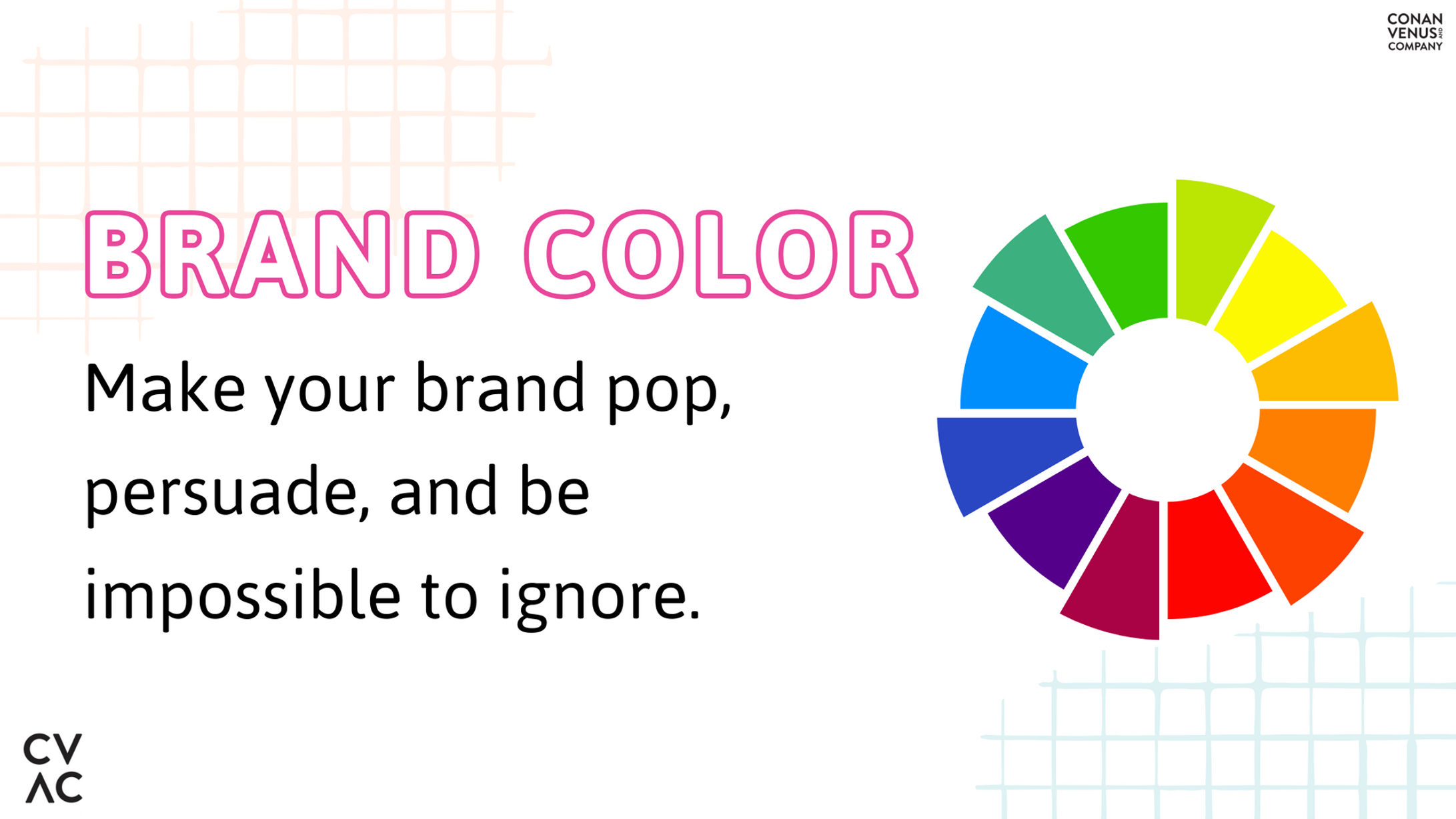
Why Brand Color Matters More Than You Think
Humans process visuals faster than words. And color? That’s the first thing the brain registers.
Red signals urgency and action. It’s why clearance sales and fast-food chains gravitate toward it.
Blue suggests trust and competence—mainstays in banking and tech.
Green brings to mind growth, wellness, and sustainability.
Color influences emotion, which influences decisions. Simple as that.
Define Who You Are—Then Choose Accordingly
Your brand personality should drive the palette.
If you’re bold, creative, and high-energy, lean into vibrant tones. Think magenta, electric blue, or citrus yellow. If your vibe is more refined or premium, richer colors like navy, deep plum, or charcoal add weight and elegance.
Choosing color based on what’s trendy, safe, or “popular” is the branding equivalent of mumbling in a loud room. Pick colors that speak clearly and confidently about who you are.
Consider Who You’re Speaking To
Branding isn’t about your favorite shade of teal. It’s about what resonates with the people you want to reach.
Younger, digital-first audiences are drawn to contrast, vibrancy, and personality. Think Duolingo, Spotify, TikTok. Now contrast that with professional audiences—financial services, B2B, health tech. These groups often respond to balance, simplicity, and trust-signaling hues.
Know what your audience is looking for in a brand. Let that guide your decisions, not personal taste or color-wheel guesswork.
Context Counts—Globally
Color doesn’t mean the same thing everywhere.
White can signify purity in one region, mourning in another. Red might evoke excitement or danger depending on where you are in the world. Before you finalize anything, research how your palette reads across the regions you’re targeting.
Brands expanding across cultures need to lead with awareness—because what connects in one market could alienate in another.
Use the 60-30-10 Rule to Keep It Tight
Want a color palette that looks sharp across packaging, websites, ads, and social?
Use the 60-30-10 rule.
- 60%: Your main color. Sets the foundation and feel.
- 30%: A secondary color. Adds contrast and flexibility.
- 10%: Accent color. Brings attention where it matters—think buttons, highlights, or a product detail that deserves a little extra heat.
This approach keeps your visuals focused and flexible—ready to adapt across touchpoints without losing consistency.
Test in the Wild
Colors don’t behave the same across media. A shade that pops on desktop may flatten out on mobile. A warm neutral in print could go muddy on screen.
Run real-world tests before locking anything in. Preview your palette on social posts, product labels, slide decks, and signage. Check it under different lighting conditions. Evaluate it across devices. Get outside the Figma file.
Because the true test of a brand color isn’t how it looks on a mood board—it’s how it shows up in motion, in market, in real life.
Don’t Compromise Readability for Style
Legibility isn’t optional. If your audience has to squint to read your content, they won’t.
Low contrast between background and text frustrates users. Worse, it makes your content inaccessible to those with visual impairments. That’s a fast track to lost engagement—and legal risk.
Use high-contrast combinations for type and key UI elements. And use tools like WebAIM’s contrast checker to make sure your design meets accessibility standards.
Good design includes everyone. That’s what makes it smart.
Skip the Trend Trap
Color trends spike fast—and crash just as quickly.
Designing your palette around this year’s “hot shade” may feel modern today but can feel stale within months. That leads to rebranding fatigue, not brand equity.
Sustainable palettes come from strategic foundations. When color aligns with your mission, audience, and values, it has staying power. Consistency earns recognition. Recognition builds trust.
Choose colors with longevity baked in. The kind people remember five years later, not five scrolls later.
The Color Strategy Recap
✔ Start with your brand’s personality
✔ Understand how your audience sees and feels color
✔ Respect cultural nuance
✔ Apply the 60-30-10 rule for visual balance
✔ Test across platforms before committing
✔ Prioritize contrast and accessibility
✔ Choose with strategy, not hype
Make Color Work Harder for You
A great palette tells your story instantly. It guides decisions, builds emotional bridges, and makes your message stick.
If your current brand colors don’t carry that kind of weight—or if you’re starting from scratch and don’t want to get it wrong—this is the time to step back and get strategic.
At CVAC, we help brands clarify who they are and translate that clarity into color, tone, and creative that resonates.
Your brand deserves to be more than recognizable. It deserves to be unforgettable.
Got any more questions on how to choose brand colors? Reach out—we’re happy to help you build a palette that connects, resonates, and converts.